Dr Pepper Cherry


 The target audience for the Dr Pepper cherry advert is mainly ages 14 - 21 because of the young, fun vibe the advert portrays, with famous singer from the popular pop band, the black eyed peas, while also using their music,which is targeted to this age group as well. I think its also targeted more towards teenage boys and young men. this is because the advert uses, Fergie, an attractive young famous woman and she is portrayed sexually in the promotion. for example, the advert shows her in sexual clothing and she looks direct at the camera. Also there is a clip towards the end showing her removing the cherry stem from her mouth, tied in a knot, which many people will know this trick has myth behind, which is that the tongue is a strong muscle and people say that they are good kissers. Therefore, this will appeal to young men and teenage boys.
I think the producers grab this target audience using a lot of sexual reference's with Fergie making the drink product look good and as a must have drink. example's of this include her picking up the can, opening the can and bringing it towards herself in a slowly and sexy way, yet also to the beat of the music. This then has an effect on the target audience as they then notice the sexy beat and soundtrack which then engages them even more as it adds effect and atmosphere onto the visuals.
Advertising techniques used in this Dr Pepper Cherry advert include 'Snob Appeal' and 'Testimonial'. Snob Appeal is used in the commercial with Fergie looking glamorous and done up to perfection, with make up and costumes. Therefore, making the product look glamorous and luxurious as a big star is shown with it. producers also use testimonial as a technique, with the black eyed peas star promoting the product to the audience and her fans. they also use their website to promote the product with the snap shot above. this is a app where you can have a picture beside Fergie, which fans and the target audience may be interested in doing.

Apple Tango


Link to Advert
 I think the target audience of this commercial is males aged 14 to 30 and of lower to middle class. I believe this as the advert has a ordinary male starring in it and a man voice over which is spoken just like a football commentator with a informal mode of address. This then relates to males as they would be the target for football games also. also it is commentated just like a football game would be. For example, when he falls in the bath, it then resembles a goal in football. the reason the audience is a wide range age, is because most males enjoy football and also the man in the add portrays a middle aged man.
 The producers of this advert have targeted the audience very well, as it is a comical advert, which appeals to men and also the voice over commentator getting loud and excited when the man finally drops into the tango bath, portraying men at a sports game when a player scores. Also the dark lime green and black colours of the logo are very manly colours. The producers also use enigma as a persuasion language, by the product is not revealed until the very end, with only small guesses in the advert, such as the first establishing shot, showing the apples and jug.


 The producers of this advert have targeted the audience very well, as it is a comical advert, which appeals to men and also the voice over commentator getting loud and excited when the man finally drops into the tango bath, portraying men at a sports game when a player scores. Also the dark lime green and black colours of the logo are very manly colours. The producers also use enigma as a persuasion language, by the product is not revealed until the very end, with only small guesses in the advert, such as the first establishing shot, showing the apples and jug.
wit and humour is used as a promotional technique from the commentating, to the man going into the tango bath, to then the slogan of, 'you know when you've been tango'd'. As this is a witty comment relating to the man slapping into the bath with the tango falling back onto him. I think the slogan also is an technique for promotion because this has turned into a well known phase over the years, as they use it in all their adverts and it sounds humorous to say. The producers have targeted more of a sports theme throughout the advert while adding in humour, as the jumping into a bath of tango is seen as a fun idea.

The logo relates to the product's slogan as it show's an open lips which is green like the apple tango drink. this resemble's the slogan's message as it portray's to the target audience that the person's lips has been drinking the product, therefore turning the person 'tango'd'. It also has green bubbles coming from the apple showing that it is a fizzy drink. The background is black to exaggerate the foreground.
The slogan is, 'you know when you've been tango'd', showing that the drink is a powerful drink and is comical when relating to the advert. The writing is in green, once again relating to the flavour and is in a child-like font, relating to the silliness of the advert. They also add the website on the advert for extra promotion and sales. Lastly, the bottle itself is promotional to the audience as it is a fun and different shade, when compared to other fizzy drinks.
Lucozade

Link to Advert

 The audience of this Lucozade advert, in my opinion, is towards 14 - 19 year old, of both, male and female sexes. I think this firstly, because of they age range of the young cast within the advert and also because of the energetic vibe and the backing music. The producers have targeted this audience as they are young and wanting to be out their energised, in which they will get this drink. the producers get the target audience by using modern dance music,'Louder'' and use post production effects where they go with the beat fast-forwarding and slow motioning clips, which makes it more interesting to watch and creates a party atmosphere. They also show modern 'cool' sports, such as skateboarding and roller skating, which appeals to young people.
 Techniques uses to promote include facts and figures, as towards the end it shows it has 'less than 50 calories' in. it also uses the song to promote itself and also promotes the song, as it show's credits at end. This gets the audience to become aware of the product as when they hear the song on the TV, they will watch the advert. The producers also use the 'YES' slogan as a campaign to promote the drink.
they have mainly targeted sport and health groups in the advert, showing the high volume of movement and fun, yet also making sure they put in the '50 calories' shot. You could also say that they have targeted aspiration groups as they force on the audience the 'YES' campaign and the beat and dancing gets them feeling positive.

The logo is very bold in all areas, with the brand name in bold sharp letters and then is placed inside an arrow like shape, almost like a rocket shape. this shape could then force the bold, powerful theme ahead more so, as a rocket is the most powerful vehicle machine known of. the colours are yet, light and enthusiastic, with light blues and yellows. This then relates to the energy drink as the logo is portrayed as powerful and energetic, making the consumer believe that the product will make them feel like this.
The slogan for the Lucozade advert is 'YES', which is about inspiring the audience to aim and do a 'YES' moment for themselves. the slogan relates to the advert as you see one girl at the beginning and then she gets everyone to join in and show off their talents and you see how good they feel about this.


I think this coke advert is targeted at 16 - 27 year old woman. I believe this as it is photographed, portraying cupcakes, something like you would see in a baking magazine, which are targeted at woman. Also cupcakes and the flowers are aimed at woman as a stereotype with the elegance and posh maturity of the photo. For these reasons, target audiences could also be middle to upper class. Also females and higher people in the society, are attracted to petite objects and potions.
By putting this advert in the paper, the middle and upper class are more likely to see it as they may be busy people, with little time for TV. The producers also resemble the cokes to cupcakes as they are feminine and portrays a light treat, as if it's ok to treat yourself to a small coca-cola. the producers use the technique, 'glittery generalities' by making the cokes look high class and trendy, like a must have. they do this by the mature photography with the background out of focus and also with the small portions upon a cake stand.
The logo is the classic Coca-cola sign, which is written in a soft and smooth font, with joint letters. it then has a white sparkly swirl line at the side of the writing, with the sparkles showing that it is a fizzy drink. the white swirl line also resembles a shiny product. For example, when an object has a bright light on it, it bounces back the light causing a shine. therefore it could be said that the producers try to portray that that product is a star in the spotlight. the colours are white and background red to boldly stand out.


Mini-Coke

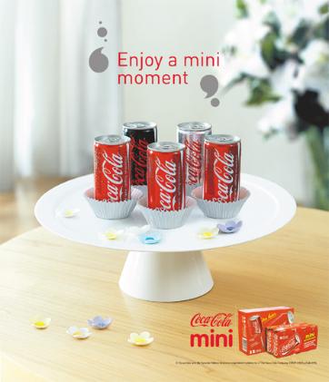
I think this coke advert is targeted at 16 - 27 year old woman. I believe this as it is photographed, portraying cupcakes, something like you would see in a baking magazine, which are targeted at woman. Also cupcakes and the flowers are aimed at woman as a stereotype with the elegance and posh maturity of the photo. For these reasons, target audiences could also be middle to upper class. Also females and higher people in the society, are attracted to petite objects and potions.
By putting this advert in the paper, the middle and upper class are more likely to see it as they may be busy people, with little time for TV. The producers also resemble the cokes to cupcakes as they are feminine and portrays a light treat, as if it's ok to treat yourself to a small coca-cola. the producers use the technique, 'glittery generalities' by making the cokes look high class and trendy, like a must have. they do this by the mature photography with the background out of focus and also with the small portions upon a cake stand.
The logo is the classic Coca-cola sign, which is written in a soft and smooth font, with joint letters. it then has a white sparkly swirl line at the side of the writing, with the sparkles showing that it is a fizzy drink. the white swirl line also resembles a shiny product. For example, when an object has a bright light on it, it bounces back the light causing a shine. therefore it could be said that the producers try to portray that that product is a star in the spotlight. the colours are white and background red to boldly stand out.
Fanta


The target audience is teenagers to young adults aged 12 to 19 of both sexes. i think this as the poster advert and TV advert is themed very vibrant and fresh, relating to the young people's personalities. Also in the TV advert, there are character's texting and socialising portraying the target audience's day to day lives. Also it is all modernly done animation which is an up and coming technology, which relates to the Fanta portraying that it is a must have up and coming drink. Also young people always like to be up to date with technology's.
The adverts producers have targeted these groups by using the vibrant colours, such as oranges and yellows, as it attracts the young people's eye. also in the poster, they show that Fanta will make you fun. For example, the mouth is open, with the Fanta coming out and making a funky shape, with flowers and fun fair like wheels, growing out of it. The lips may also attract the audience's eye, aiming more towards the males for the sexiness. the groups the producer's have specifically targeted is trendy and cool, using the colours and new technology and retro style in the adverts. Techniques used to promote include Glittering generalities, making the audience feel trendy and cool with the purchase of a Fanta.
The logo is simple yet effective, with the brand's name written in blue squeezed together, portraying the squeezing juice of an orange. the is also done in a graffiti like style, once again relating the the youth audience.then an orange circle portraying an orange is put in the background. the logo is outlined in white and white outline is also placed with the brands name, making the logo and blue writing stand out and look fresh. a leaf and orange is then placed within the logo, stating the ingredients and extra flavour, with the leaf resembling a fresh flavour, such as mint.
No comments:
Post a Comment